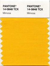
 In early December, Pantone, the world-renowned authority on color and provider of professional color standards for the design industries, announced in early December that “PANTONE® 14-0848 Mimosa” is the color of the year for 2009. Described as “a warm, engaging yellow”, this bright hue appropriately contrasts a a time of economic uncertainty and political change with a blatant optimism. No other color expresses hope and reassurance more than yellow.
Best illustrated by the abundant flowers of the Mimosa tree and the sparkle of the brilliantly hued cocktail, the 2009 color of the year represents the hopeful and radiant characteristics associated with the color yellow. Mimosa is a versatile shade that coordinates with any other color, has appeal for men and women, and translates to both fashion and interiors. Look for women’s accessories, home furnishings, active sportswear and men’s ties and shirts in this vibrant hue.
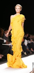
In terms of fashion, I have scourered the internet looking for shades of yellow in Spring 2009 collections and the closest thing I could find is from Carolina Herrera‘s collection from the Mercedes Benz runway show in New York back in September. And “popular media” describes her full length, one-shouldered dress [shown below] as “marigold”.


*photo credit to New York Post
Oh – and this just got sent to me by a reader: Kate Hudson in a mimosa-ish colored dress on the cover of the February 2009 issue of Elle Magazine.

But perhaps Pantone isn’t expecting Mimosa to be applied to the fashion world? They have a separate fashion color report for Spring 2009 that can be downloaded here. With regards to Mimosa, maybe there can be more practical household applications for this color. Pantone also has a line of “superior-quality, eco-friendly” paint with the foresight that “painting a wall in Mimosa will add warmth and cheerfulness to any room, especially during the winter months. Mimosa also creates the illusion of being connected to the outside, making small rooms feel open and inviting”.


